Monday, November 20, 2017

Cyanotype and New Zealand Ferns - a Not-So-Original Idea

I first began printing on cyanotype-prepared fabric this spring, after our February visit to New Zealand. Ferns I had collected in Abel Tasman Park were particularly suited to this method of printing.
I got spectacular results printing between about 11 a.m. and 1 p.m., when the sun was at its strongest. The rich indigo of the background was the perfect way to draw attention to the lines of the fern fronds.
Over the next few months I made several pieces which incorporated these prints. I especially enjoyed being able to combine them with African, Japanese and batik indigo prints I'd collected over the years. Even shirting scraps combined well, as well as the indigo shibori fabric our small Fibre Art group made together the previous summer.

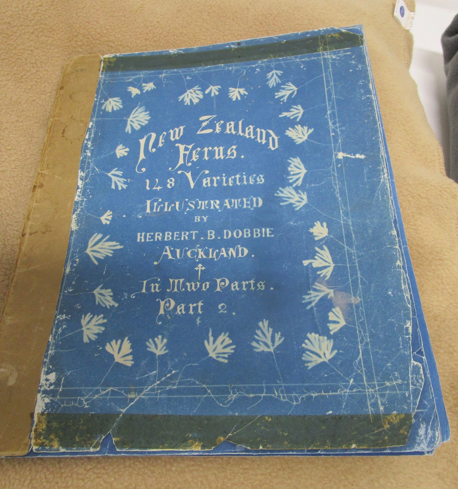
Some of the tiniest ferns were perfect for card-making, and disappeared at our group exhibit at the Ladysmith Art Gallery in August. So I had returned to New Zealand on the lookout for more ferns, and thinking about how to work with them. One day very recently, I was looking through a book that was issued in conjunction with a photography exhibit at Te Papa - the National Museum, and was intrigued when I turned the page to find this:
It is a cyanotype print on paper, made in 1880, by Herbert Dobbie. Herbert was an engineer who lived in Auckland, and who had a fondness for ferns. This was before cameras were commonly available, and he turned to cyanotype to record his findings.

He recorded 148 different varieties of ferns in this manner, and published them in what is now known as his "Blue Books". Only 14 copies still exist worldwide, and several of them are at Te Papa in Wellington. After doing a little research, I discovered that I could make an appointment to see rare books in the collections department of the museum, and this is just what I did. I couldn't quite believe it was that easy.
Most of the pages are still is excellent shape. The person helping me said the faded ones had probably been exposed to light at some point.
But even then, they were fabulous. Such an exciting discovery. I put on the gloves provided, and slowly turned the pages one by one.
I had also asked to see the New Zealand Ferns book by Dobbie that was published in 1921, and became the authority on New Zealand ferns for over 50 years. It's in black and white, and have jest learned that copies are available even now, and for a reasonable amount, as the book was reissued a few years ago.
What I didn't know, and what was the most exciting of all, was that Te Papa also has the original photo album of all the photos that were eventually included in that 1921 book. And it was incredible.
 Here's a side-view, showing the depth of it. And it was in excellent shape. What a treasure!
Each specimen had been carefully photographed, with the name had been added, in a most careful and exact manner.
And there were photographs showing the size of some samples, in relation to the size of people. Needless to say, I've already ordered a copy of the it for myself. And am more excited than ever to pursue this area of research, ready to see what work results from my investigations. I'm beginning to understand far more deeply, why it's so important to do the research in your area of interest as you move forward with the actual making. It leaves me with the feeling that I've met this pioneer in printing ferns, and share his interest in printing in blue, if not having the scientific bent required to push this in a more scientific direction. Thank you, Herbert Dobbie.

Monday, November 13, 2017

Improvisational Piecing Inspired by Kuba Cloth

Kuba cloth is one of two very distinctive types of cloth made in what was known as Congo, and now is the DRC. Typically two colours of raffia are knotted into a burlap-like base fabric, resulting in complex patterns of woven and slightly raised threads.
Kuba cloth designs are often worked on the diagonal, which is one of the reasons they appeal to me so much. Their imperfections are another aspect of their charm. And it is quite common to see one part of a design "collide" with another, as though two different people had been working on it.
I have admired these very graphic pieces of cloth for sometime, but it was the photograph below that inspired me to work with some of the shapes. It's from the book African Textiles by Christopher Spring, and is a sample that can be found at the British Museum.
I have worked with it once before, on a smaller piece, and returned to it this week while thinking about ideas for a piece I have committed to make for the Vancouver Island Surface Design Association (VISDA). The theme of this particular exhibit is "Pathways". And all those diagonal lines running between the rectangular blocks look just like pathways to me.
I started by making two types of units - rectangular block units and strip units - using the fabrics I'd chosen to bring with me to New Zealand.
I began joining them together on the diagonal. Knowing that the finished piece needed to be 12" x 60-72", I squared off the bottom and side corners to 13" when there were enough pieces joined together to do so.
I thought about squaring it off at this point, and might still do so, but felt compelled to keep adding to it a bit more before deciding whether or not that's what I want to do. For now it's spending a little time up on my design wall before I decide what to do next.
This is very much a work in progress, but I like the way it's going so far. The questions I'm asking myself now are: Do I want to add other design elements next? If so, which ones, and how can I keep them on the diagonal? Should the join between the first unit and the second be a horizontal line, or should it be on the diagonal too? Does it look better upside down than in this orientation? How will I work this so that the whole piece is balanced? Will it need another unit pieced a similar way at the top of the work? This way of working - asking these questions and considering the possible answers, weighing them and then moving forward to see what happens next - this is what I love most about improvisational piecing. I may have an idea where I'm headed, but I can't know the outcome at the beginning. It is very much a conversation that takes place between me and the fabric, me and the design. Each piece made this way is an adventure of sorts. I have to be prepared to fail spectacularly (by my own measure). Still, it is now my favourite way of working.

Monday, November 6, 2017

More Inspiration Photos

While the class I'm taking with Lisa Call has moved on to composition - and I will too, soon - I have continued taking lots of photos that look at line and shape. I feel I'm looking so much more closely at these elements, and learning so much in the process. I don't want to rush past this too quickly. Photos are one way to keep a record of what I see and what I think about it. Sketching is another, but more on that later. Here are some of the photos:
A rock formation at Castlepoint. Undulating curves. Sumptuous is the word that comes to mind.
A plan tree where some of the bark has come off. This is about texture as much as about line and shape. As is the rock formation above.
Tropical leaves of some sort - I don't know the name of the plant, but I know I like those curvy edges and the vein pattern and the secondary pattern that is formed where the edges overlap one another.
I was playing ball with Griffin the other day and happened to glance down at the it, and at the lines and shapes that resulted depending on how the ball had landed. I took a whole series of photos of these. Most interesting.
                            
The lighting on the hull of this boat is not good, but the lines are beautiful. I am reminded of how often I have looked at boat plans - those graphic line drawings that are plans for boat builders - and wondered about spending more time investigating them, and thinking of including them in my work. Boats are such an apt metaphor for life, for living, and being by the sea and in a boat are two of my most favourite things. Note to self: Time to do a little more research in this area. Some sketches. Some reading. And then some stitching.
Sunrise at Castlepoint. Sky lines. Beach lines. Horizon lines. Sand lines.
A ten minute walk from Emily and Michael's home is this marina. Multiples of masts reflected in the water, with the curved shapes of hulls in between. The next time I go back there I will take more close-up photos. That's when I can best see the details of line and shape. That's when I'm surprised by what is in front of me, what I could so easily miss, if I were to limit myself to the big picture.


Monday, October 30, 2017

Sketches - Inspired by My Travels in Africa


I've embarked on a small project while I'm in New Zealand - to create a collection of "sketches" inspired by my travels in Africa. The parameters I set for myself are that each one will be 6" x 6", use raw edged fabrics, and be hand-stitched. I've completed the first five, and am experiencing that thing that sometimes happens when you don't know at the beginning where a piece will take you, but try out the possibilities as they occur to you, and sometimes it works and sometimes it doesn't, but the process itself, the scope for serendipitous surprises, is so engaging that the whole enterprise is a delight. 
These are the fabrics I chose to bring with me to New Zealand. It took me longer to pack these than to pack my clothing. Which explains why I have no warm cardigan with me (I was coming to summer, I thought), but just the right number of fabrics to make these small pieces. They are what my daughter refers to as "enabling constraints", and for someone like me, who is too easily overstimulated by endless possibilities, they serve as a scaffolding on which to build my work.
I begin each "sketch" with a piece of fabric 7" x 7", back with a piece of low-loft cotton batting the same size. For the first one I chose a piece of rusted fabric on which to build. Actually, truth be told, I started at first with a plain white fabric, but it was too daunting, so I switched it for the rusted fabric, which made a much better starting point.
Thinking back to my recent indigo pieces, I began overlapping different sized rectangles. I was thinking of the tropical trees found in some parts of Africa, and of the oceans on three sides of the continent, of the natural state of this massive land mass, before it became so populated.
But it looked too blue. Not African at all. So I added a hit of orange - thinking of the warmth of the sun, of how truly hot you can be even at the ocean. (Remembering a day in Dar es Salaam when I suddenly realized why people were walking so slowly, and I could do nothing else but return to my hotel room where a fan turned slowly overhead, making barely perceptible changes in the movement of the air, but still, it was better than being outside and moving about.)
I liked the orange but I wanted to give it a more major role. I wanted it to undergird the rest of the design. So I removed the first bit and replaced the dark greeny-blue with orange and black. This fabric made me think of the many people walking along the roadsides just about everywhere, along roads just that colour in fact. So I added the feet. Which could be my feet as I travelled or the feet of the people I met who walk so far every day just for water and firewood.
Still not happy with that blue. Too plentiful. Too available. Not the story for many, many people. So I made more changes such that the predominant colour of the piece it orangey-red. Much better.
But I want the sky in there too - a sky that is this clear hot blue. I'm thinking of the sky over the desert in Namibia - white sands and blue sky. So I try another strip and like it better.
I add one more detail - the leaves - somehow they represent hope for me. Hope that the lives of the women I worked with are at least a little easier than they were when I met them. Hope that the world doesn't give up on Africa, that new ways are found to work with the people so that things change "slowly by slowly" in a good way. And then, when I'm happy with the placement of the fabrics,  I added the next layer - the stitching - which includes a few personal symbols. And I added the solid black facing, and once mounted on a small black canvas, it will be finished.
 Here's the second sketch.
And the third. Each one has a story behind it, a narrative that develops as I'm working, and it helps me decide what to do next, what details might still be added, what works and what doesn't. In the process I'm remembering so many of the experiences I've had, little things that had slipped into the back of my memory without me noticing it and now are being recalled again as I work. This is good, and I'm looking forward to seeing where it takes me next. Right now I'm thinking that there will be sixteen sketches in total, but that could always change. I guess it will depend on how many stories are waiting to be told.

Monday, October 23, 2017

The Elements of Design - Shape

It's pretty hard to discuss shape and line separately from one another, as most lines enclose shapes, so while I've put the photo studies of the two in different posts, they really should be seen together. I've been carrying my little point and shoot everywhere I go, and the following images are of some of the line and shape related things that have intrigued me this week. First off, a boat house, which is just about perfect to me - a house shape painted in some of my favourite colours. And look at those lines - horizontal on the siding, vertical on the door and diagonal in the window. The almost-horizontal
lines of the walkway up to the door complete the design of this much-loved escape cabin for the people who own it. I can almost imagine who they might be . . .
A seed-pod found on a beach in the north of the North Island of NZ - an extraordinary example of intriguing cross-hatched lines within a pleasing shape. I have no idea what plant this comes from, but it's exquisite.
More beach treasures, each a study of lines - lovely, curvaceous lines either inside a naturally occurring rounded shape, or else encloseing the shape.
I really have a thing for roof shapes. I fell in love these two older homes in downtown Wellington, improbably found on a side street, surrounded on three sides by newish modern buildings. Havana, on the left, is reputed to be one of the best restaurants in town, and across the road is Lighthouse Cuba, a repertory cinema of several small galleries, each furnished with a small number of art deco-type upholstered chairs and couches with little tables beside each one for your ice cream or glass of wine or flat white, so you can watch whichever movie you've chosen in ultimate comfort. We went to see Maudie - heart-wrenchingly good. I'm still mulling over the story . . .
Back at the beach (they're never very far away in this country.) here's a clump of recently washed-up seaweed. Are those curving lines, or are these shapes?
Another sort of seaweed altogether, found at the tide line (there's another line I could spend some time studying), in a lovely arrangement, forming a curve shape and with the rounded shapes of storm-worn stones nestled up along side it.
And the curves of the human form (shape), juxtaposed with the horizontal lines formed by the wood slats of the behind him. Yes, I'll admit it. I'm an unabashedly doting grandmother to this almost-two year old, and couldn't resist the temptation to use this photo in this post. After all, we did do all this research together.

Tuesday, October 17, 2017

The Elements of Design - Line

The last week, as part of my course work with Lisa Call, I have been looking at the use of line in design a little more closely and a little more deeply. As part of this exercise, I took a short walk this afternoon  around the neighborhood of Kilburnie in Wellington, New Zealand. I arrived here to visit my daughter and her husband, and my 22 month old grandson yesterday, and as often seems to happen when you visit unfamiliar places, I had new eyes for seeing here and soon found numerous examples of line. First there were the yellow broken lines running down the middle of the road,
and letters painted on a fence, each one made of other broken lines, and of complementary colours in order that stand out unmistakably to passersby.
Fences are everywhere, each composed of lines formatted in hundreds of ways. Here a wide line is followed by two thinner lines, all the lines being cut to the same length, and attached top and bottom to two (almost) horizontal lines.
As I'm writing this, I'm realizing that the three examples above are all lines in things that are man-made, and contrast hugely with the organic trunk lines of pohutakawa trees planted outside a nearby school. Maybe the trunks are even more dramatic because they're juxtaposed with the lines of the street and the school.
The pleasing lines of these windows are more complex. Straight lines and curved lines. Lines that enclose rectangles and lines that enclose diamonds. Beautiful.
But straight lines can be found in nature, as well as in windows and fences and as street markings. Parts of this palm tree look like spiked lines radiating out from a centre, perhaps from a branch. Each one widest at the base and thinning until it ends with a point.
For some reason I find this sign particularly pleasing, warning drivers that they are approaching a pedestian crossing. Something about the perspective, I think.
This photo of the side of nearby house was the most complex of all, with horizontal lines formed by the wooden siding, cross-hatching on the climbing frame, simple straight lines and one single diamond in the stained glass windows, diagonal roof lines and vertical fence lines. Together they are in perfect balance.
And of course written letters and numbers are all made up of lines too. With hundreds of varieties of fonts available for use, or our own unique hand gestures forming them.
Griffin is showing me where I can find a lemon, just beside his home. It wasn't until I was choosing which photo I'd load onto this blogpost that I noticed the lovely contrast between the outside almost-but-not-quite round of the lemon and the check of his jacket. And then there are the horizontal stripes of his shoes and the vertical lines of the fence. Even the diagonal line of the sidewalk plays an important role in this shot. This was a most interesting exercise, and I will be following it up by looking at which lines I most like to use in my own work, among other things. I have a feeling I might be dreaming about lines tonight.